
Scavenge
I had the privilege of working through this challenge with three other designers, and the result is bold, bright, and playful; Scavenge is a game that gets its players out of the house to have a fun night out on the town. The game is a modern take on a scavenger hunt, and since the challenge was to design a party game, our team set our target demographic as college students.
The game is straight forward— Decide how long the groups would like to play, and then draw cards from each deck: Locate, Action, and Double. Each team can keep track of points using the Scavenge App, eliminating the hassle of carrying around task cards, and allowing each team member to have the list on hand. Complete as many tasks as possible and arrive to the final meeting spot before the time runs out. The team with the most points is the winner of Scavenge.
Here is how my team and I reached our solution.
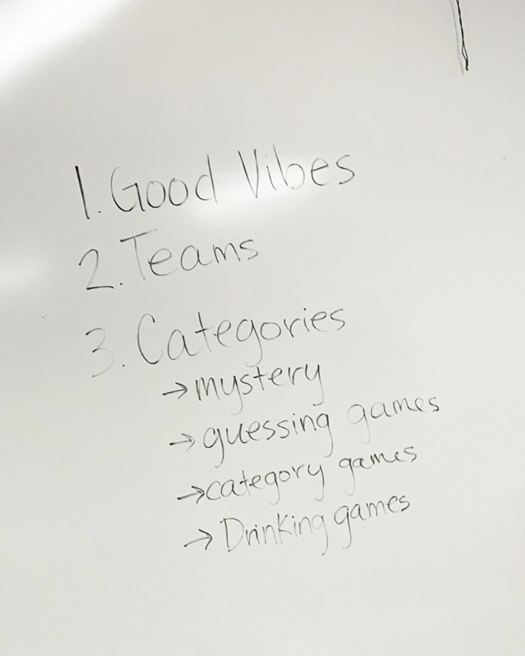
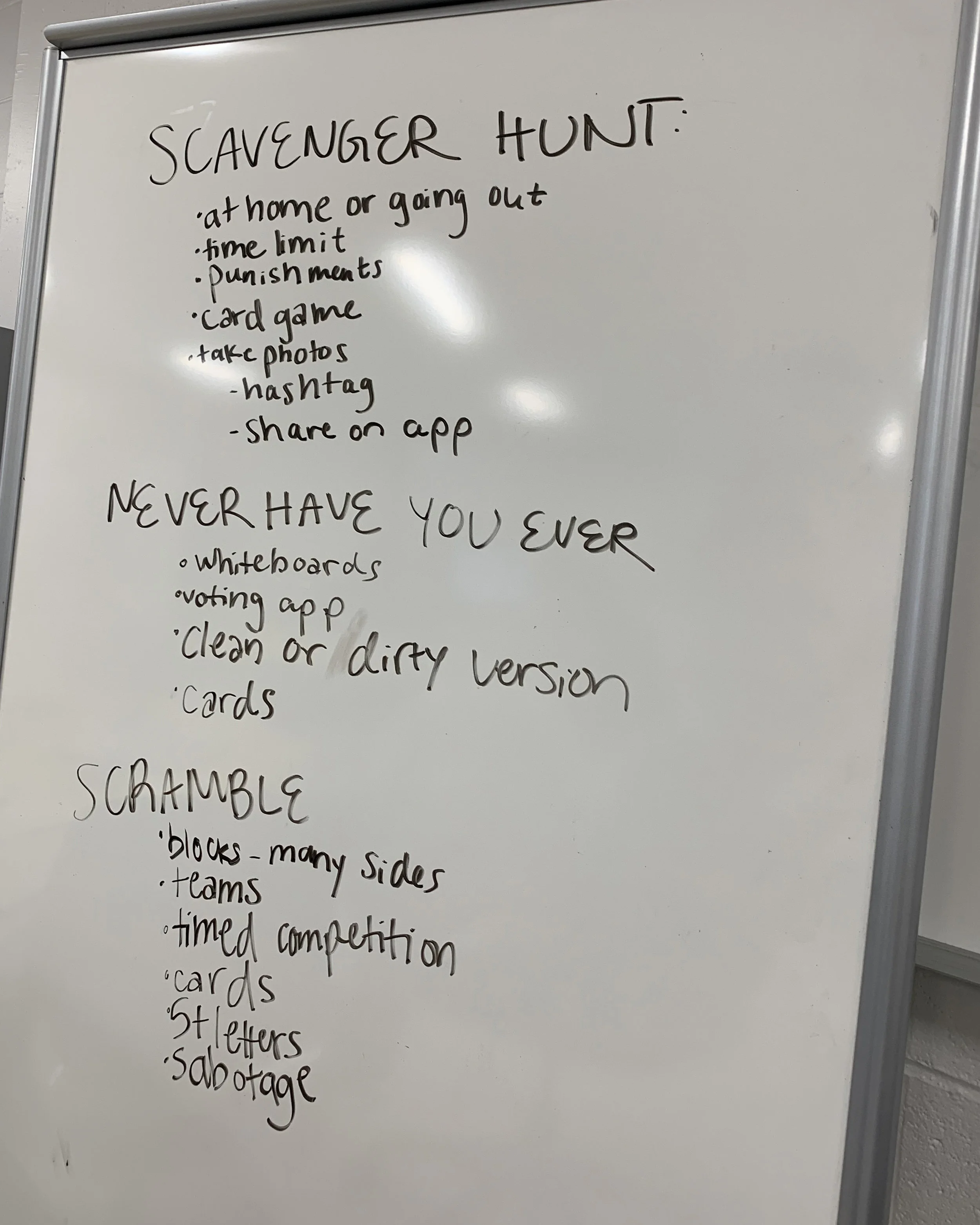

Before designing, our team brainstormed ideas that would make party games, and what would make bad party games. We grouped together similar ideas and created three categories we wanted to incorporate into our game: Good Vibes, Teams, and Categories. We each individually created a list of game ideas and came back to discuss our ideas. Our top three ideas were a scavenger hunt game, never have you ever, and scramble. We then put each idea to the test to decide which would make the best party game while factoring in originality, playability, and level of fun, and the scavenger hunt idea passed that test.

We then created a moldboard to get a general idea of our overall aesthetic. While researching inspiration, our team was looking for interesting colors, shapes, and patterns that could spark an idea to use for the cards rather than looking at other game board designs. We found ourselves on the same page with the style we wanted to capture— bold, contemporary, edgy, playful, and eccentric.


We each individually designed rough compositions.


After a few meetings, the team decided that the three designs above were the right direction to go, and that we wanted to take the designs a step further.
One of the major roles I played in this project was the iconography. My process consisted of going through all of the tasks we brainstormed for cards and designing an icon that would fit each individual card, while communicating with my team members to see if they noticed any icons that needed to be illustrated. We came across the challenge of how to incorporate the icons elsewhere throughout the design. The team agreed that icons would be a creative addition to the cards, but we did not want to scrap the gradient-mapped image on the front of the card. After a few experiments, the team came to liking the idea of incorporating patterns into the design.


The final card designs are bold, playful, and contemporary, which reflects our moldboard. The icons I illustrated were made into patterns and used in the background.

Individual boxes were designed to hold each deck together, while eliminating the cards moving around in the box, as well.


